
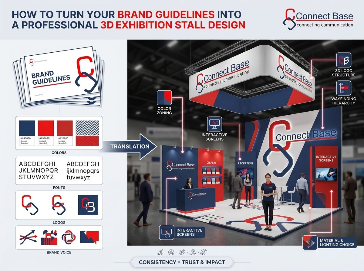
When visitors walk down a crowded exhibition hall, they form an opinion about your company in under five seconds. In that brief window, your exhibition stall has to do the work of a hundred sales pitches — communicating who you are, what you stand for, and why it’s worth stopping. The single biggest factor that decides whether your stall succeeds or fades into the background isn’t the size of your budget. It’s whether your brand guidelines have been translated correctly into a 3D exhibition stall design.
Many businesses spend months perfecting their brand book — colors, typography, logo usage, tone of voice — only to hand it over to a stall fabricator who treats it as an afterthought. The result is a booth that technically has the right logo somewhere on it, but feels disconnected from the brand experience customers expect everywhere else. At Connectbase Communications, we’ve built our exhibition stand design process specifically around solving this gap. In this guide, we’ll walk you through exactly how to turn a static brand guideline document into a fully realized, professional 3D exhibition stall design that gets noticed on the show floor.
Why Brand Consistency Matters More on the Exhibition Floor
Your website, packaging, and social media are consumed in isolation. An exhibition stall is different — it’s judged in direct comparison, sitting metres away from dozens of competing brands, all vying for the same footfall. This side-by-side exposure means small inconsistencies that visitors would never notice online become glaringly obvious in person.
A stall that doesn’t match your digital and print identity creates a subtle but real trust problem. Visitors subconsciously ask, “Is this the same company I saw online?” Brand consistency across every touchpoint — including your physical exhibition presence — reassures prospects that they’re dealing with a serious, established, professional organization. This is especially important for B2B exhibitors, where purchase decisions often depend on perceived reliability and scale.
Step 1: Audit Your Existing Brand Guidelines
Before any 3D design work begins, the design team needs a complete picture of your brand system. A proper brand guideline document for exhibition purposes should include:
- Primary and secondary logo files in vector format (AI, EPS, or SVG), including any approved variations (light background, dark background, icon-only)
- Color palette with exact hex, CMYK, and Pantone values — crucial because printed materials and painted surfaces render color very differently than screens
- Typography — primary and secondary fonts, along with fallback fonts for situations where the primary typeface isn’t licensed for large-format printing
- Imagery style — whether your brand uses photography, illustration, iconography, or a mix, and the tone of that imagery (corporate, playful, minimalist, technical)
- Brand voice and messaging pillars — the core value propositions that should appear as taglines or headline copy on the stall
- Do’s and don’ts — common misapplications to avoid, such as stretching the logo or placing it on a clashing background
If your brand guidelines are incomplete or outdated, this is the moment to fill in the gaps. An experienced exhibition stand design partner like Connectbase Communications will often flag missing elements during the discovery call — for instance, many brand books are built for print and digital use and never account for how colors and materials behave under exhibition hall lighting, or how a logo will look wrapped around a curved surface.
Step 2: Translate 2D Brand Elements into a 3D Spatial Language
This is where most in-house teams and generic fabricators struggle. A brand guideline is inherently a flat, 2D document. An exhibition stall is a three-dimensional, walk-through experience with height, depth, lighting, and human movement. The job of a skilled 3D exhibition stall designer is to reinterpret flat brand assets into spatial decisions.
Here’s how each brand element typically translates into 3D:
Color palette → Zoning and material selection. Instead of just painting walls in your brand color, experienced designers use color to create zones — a reception area in your primary brand tone, a product display zone using a secondary accent, and neutral tones for meeting or lounge areas so the space doesn’t feel visually overwhelming.
Typography → Wayfinding and signage hierarchy. Your brand fonts get applied not just to a hero sign, but across directional signage, product labels, and digital screens, maintaining a consistent hierarchy of headline, subheadline, and body text sizes.
Logo → Focal architecture. Rather than a flat logo sticker, the logo often becomes a 3D structural element — an illuminated logo wall, a suspended ceiling feature, or a backlit reception counter that makes the brand mark the literal centerpiece of the stall’s architecture.
Imagery style → Environmental graphics and textures. If your brand uses clean, minimalist photography, this might translate into large-format frosted acrylic panels and soft ambient lighting. If your brand is bold and technical, it might translate into exposed structural elements, LED video walls, and sharp geometric forms.
Brand voice → Interactive and experiential zones. A brand that speaks in a friendly, approachable tone might benefit from open, inviting seating layouts with minimal barriers, while a premium or luxury brand voice often translates into more private, curated meeting pods.
Step 3: Choose a Stall Structure That Reflects Brand Personality
Once the visual language is defined, the next decision is the physical stall format. This decision should never be made independently of your brand guidelines — the shape and structure of your stall says as much about your company as the colors do.
- Modular/reusable stalls suit brands that value efficiency, sustainability, and consistency across multiple shows — a message that aligns well with brand guidelines emphasizing reliability and smart resource use.
- Custom-built stalls suit brands positioning themselves as premium, innovative, or market leaders, where a completely bespoke structure reinforces the “we don’t follow templates” message.
- Double-decker stalls work for brands with a large product range or those wanting to signal scale and authority, often paired with brand guidelines that emphasize being an industry leader.
- Open, minimal-wall stalls suit brands whose guidelines emphasize transparency, accessibility, and openness — common in tech and services companies.
At Connectbase Communications, we walk clients through this decision by presenting mood boards and structural concepts that are explicitly mapped back to the brand guideline pillars, so there’s a clear, documented rationale for every structural choice — not just aesthetic preference.
Step 4: Build a Realistic 3D Render Before Fabrication Begins
A professional exhibition stand design process always includes a photorealistic 3D render stage before any fabrication starts. This step matters for two reasons.
First, it lets you catch brand misapplications early — a logo that looks too small against a large wall, a color that appears different under warm LED lighting than it does on screen, or typography that becomes hard to read at signage scale. It’s far cheaper to fix these issues in a render than after materials have been cut and printed.
Second, a 3D render allows internal stakeholders — marketing heads, brand managers, and leadership — to sign off on the design with full confidence, since they can view the stall from multiple angles, walk through a virtual layout, and compare it directly against the brand guideline document. This collaborative review stage is one of the most valuable parts of working with a specialized 3D exhibition stall design partner rather than a general contractor, since experienced designers know exactly which details brand managers will scrutinize.
Step 5: Prioritize Material and Lighting Choices That Match Brand Tone
Materials and lighting are two areas brand guidelines rarely cover in detail, yet they have an outsized impact on how “on-brand” a stall feels.
- Matte vs. glossy finishes change how premium or approachable a space feels. Matte finishes tend to read as modern, understated, and premium; glossy finishes read as energetic and eye-catching.
- Warm vs. cool lighting affects mood significantly. Cooler lighting (5000K+) suits tech, industrial, and B2B brands aiming for a precise, professional feel. Warmer lighting (2700K–3500K) suits hospitality, lifestyle, and consumer brands aiming for comfort and approachability.
- Sustainable materials — reclaimed wood, recyclable fabric graphics, modular aluminum systems — are increasingly a brand statement in themselves, particularly for companies whose guidelines mention sustainability or ESG commitments.
A good 3D exhibition stall designer treats every material choice as a brand decision, not just a budget or availability decision.
Step 6: Maintain Brand Consistency Across Digital Touchpoints on the Stall
Modern exhibition stalls aren’t just physical structures — they include digital screens, interactive kiosks, QR-code-driven experiences, and social media backdrops. Every digital element needs to follow the same brand guidelines as the physical build:
- Screen content should use approved brand templates, not generic stock presentation themes
- Interactive touchscreen interfaces should follow your website’s UI color scheme and button styles
- Photo-op backdrops should incorporate your logo and tagline in a way that’s optimized for social sharing, reinforcing brand recall long after the event ends
Step 7: Brief Your On-Ground Team on Brand Standards Too
A perfectly designed stall can still feel off-brand if staff uniforms, name badges, or promotional handouts don’t match. Extend your brand guideline audit to:
- Staff attire colors and styling
- Printed brochures, business cards, and giveaway packaging
- Verbal messaging and elevator pitches, so the spoken brand voice matches the visual one
This is often overlooked, but it’s one of the easiest ways to elevate a stall from “well designed” to “fully immersive brand experience.”
Common Mistakes Businesses Make When Converting Brand Guidelines to 3D Design
- Treating the logo as decoration rather than a structural anchor. A logo placed as an afterthought looks weaker than one built into the architecture itself.
- Ignoring how color renders under exhibition lighting. Colors that look correct on a monitor can shift dramatically under hall lighting; always request physical material and paint samples under real lighting conditions.
- Overcrowding the space with every brand element at once. Good brand translation is about restraint — choosing the two or three elements that carry the most brand weight rather than cramming in every guideline rule.
- Skipping the 3D render approval stage to save time, which almost always leads to costly on-site corrections.
- Working with a fabricator who has no design background. Fabrication and design are different skill sets; a true 3D exhibition stall design partner combines both under one roof.
Why Work With Connectbase Communications
At Connectbase Communications, we specialize in transforming brand guidelines into fully realized, professional exhibition stall designs — from initial concept sketches and photorealistic 3D renders through to on-site fabrication and installation. Our design team works directly from your brand book, ensuring every wall, light fixture, and signage element is a deliberate, documented extension of your brand identity rather than a generic template.
Whether you’re exhibiting at a regional trade show or a major international expo, a stall that authentically reflects your brand builds instant credibility with visitors and gives your sales team a stronger environment to convert leads.
Ready to turn your brand guidelines into a stall design that gets remembered? Get in touch with our design team at www.connectbasecommunications.com or write to us directly at bhavesh.connectbase@gmail.com, and let’s start building your next exhibition presence together.
Connectbase Communications is an exhibition stall design and fabrication company helping brands create professional, on-brand, and memorable 3D exhibition experiences.
