
3D Exhibition Stall Design
Two exhibitors can spend the exact same budget on the exact same size stall — and one will feel busy, engaging, and easy to navigate, while the other feels cramped, confusing, and empty even when it’s technically full of people. The difference almost always comes down to one thing most exhibitors never plan deliberately: visitor flow.
Visitor flow is the invisible architecture of your stall — the path people naturally take when they enter, where they pause, what they see first, and how easily your staff can move between them without creating bottlenecks. Get it right, and your stall feels alive and welcoming even with modest footfall. Get it wrong, and even a beautifully designed stall can feel like a maze visitors want to escape.
This guide breaks down exactly how to plan visitor flow for your next exhibition stall — from entry points to exit strategy — so your design doesn’t just look good, it actually works.
Visitor flow refers to the path people take as they move through your exhibition stall — from the moment they notice it from the aisle, to entering, exploring, engaging with your team or products, and eventually leaving (ideally as a qualified lead).
Poor visitor flow creates specific, measurable problems:
Good visitor flow solves all of this by design — not by hoping visitors figure it out themselves.
Before diving into layout techniques, it helps to understand a few consistent patterns in how people behave at trade shows:
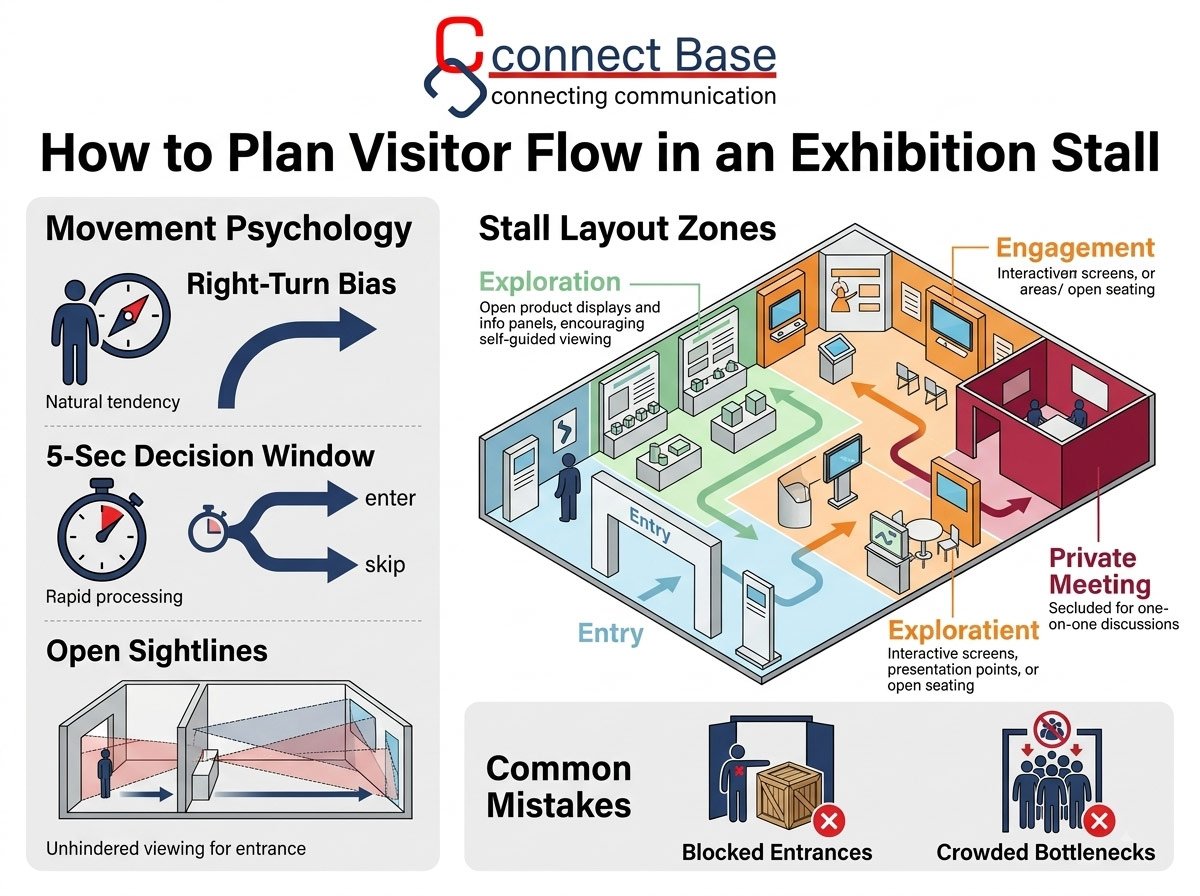
The 5-second decision window. Most visitors decide whether to enter a stall within the first 3 to 5 seconds of seeing it from the aisle. If the entry point isn’t obvious or inviting within that window, they’ll walk past.
The right-turn bias. Studies on retail and exhibition behavior consistently show that a majority of visitors turn right upon entering an open space. This is a small but useful detail when deciding where to place your highest-priority display or messaging.
Avoidance of dead ends. Visitors are naturally reluctant to walk into a space that looks like it has no other exit, especially in a busy hall where they may feel obligated to make small talk with staff before leaving. Stalls with a clear “loop” or multiple sightlines tend to see higher entry rates.
Comfort with open sightlines. Visitors are more likely to enter a space where they can see what’s inside before committing to walk in. Solid walls or overly enclosed entrances can unintentionally discourage entry, even when the space beyond is appealing.
Understanding these patterns helps explain why certain layouts consistently outperform others — it’s not just aesthetic preference, it’s how people naturally navigate unfamiliar spaces under time pressure.
Before anything else, decide how many entry points your stall will have, and where. This depends heavily on your stall type:
Whichever configuration you have, the entry itself should be visually open — avoid a tall reception counter or solid signage wall directly at the entrance, as this blocks sightlines into the stall and reduces the “can I see what’s inside” comfort factor visitors rely on.
Once entry points are set, divide your stall into functional zones and think through the logical order a visitor would move through them:
The mistake many exhibitors make is placing the engagement zone (where staff push for conversation) too close to the entrance. This can feel aggressive and actually discourages visitors from entering at all. A short exploration zone before any direct staff interaction gives visitors a chance to self-select — browsing at their own pace before deciding whether to engage further.
Once your zones are mapped, think about how a visitor physically moves between them. A few proven layout principles:
Create a loop, not a dead end. Where possible, design the stall so visitors can walk through and exit from a different point than they entered, rather than having to turn around and walk back the way they came. This reduces the “trapped” feeling that discourages entry.
Keep primary walkways at least 1.2–1.5 meters wide. Narrower paths cause visitors to feel crowded, especially when staff or other visitors are also moving through the space.
Avoid placing your best display against a side wall visitors won’t naturally walk toward. Use the right-turn bias to your advantage — place high-priority products or messaging in the natural path of movement, not tucked into a corner that requires deliberate effort to reach.
Use flooring, lighting, or level changes to subtly guide movement. A slightly raised platform, a change in flooring material, or directional lighting can guide visitors toward key zones without needing signage that explicitly says “this way.”
Limit visual clutter along the path. Every additional sign, banner, or freestanding element along a walkway is a potential obstacle — both physically and visually. Keep pathways clear and let key messaging live at focal points, not scattered throughout.
Visitor flow planning often forgets one crucial group: your own staff. If your team can’t move efficiently between the welcome zone, product displays, and meeting areas, they’ll either create bottlenecks or spend the show awkwardly squeezing past visitors.
Consider:
A well-planned staff flow keeps your team visible, available, and unobtrusive — exactly the balance you want during peak show hours.
Your stall might feel spacious during a quiet morning slot and completely overwhelmed during a lunchtime rush. Plan your layout for your busiest realistic moment, not your average one:
If your stall only works well when traffic is light, it will fail you precisely during the moments that matter most — when the hall is busiest and your competitors are also fighting for attention.
Visitor flow planning is built into every stall we design at Connectbase Communications — not as an afterthought once the visual design is finalized, but as one of the first considerations during the briefing and concept stage. We map entry points, walkways, and functional zones based on your specific goals, expected footfall, and stall configuration, so the final structure isn’t just visually striking — it’s genuinely easy and inviting for visitors to move through.
If you’re planning an upcoming exhibition and want a stall designed around how people actually move and behave on a show floor, we’d be glad to help.
📩 Email: bhavesh.connectbase@gmail.com 🌐 Website: www.connectbasecommunications.com
Visitor flow is one of the most overlooked aspects of exhibition stall design — yet it directly affects how many people enter your stall, how comfortable they feel once inside, and how effectively your team can engage with them. A stall built without deliberate flow planning relies on visitors figuring things out themselves; a stall built with flow in mind guides them naturally, from that first glance at the aisle all the way to a meaningful conversation with your team. Before your next show, treat visitor flow as seriously as you treat the visual design — the impact on your results may surprise you.
1. What is visitor flow in exhibition stall design? Visitor flow refers to the path people take through your stall — from entry to exploration, engagement, and exit — and how the layout guides that movement naturally and comfortably.
2. Why shouldn’t I place a reception counter at the entrance of my stall? A counter or tall structure at the entrance can act as a physical and visual barrier, discouraging visitors from entering. Keeping the entry open improves visibility into the stall and increases walk-in rates.
3. Does visitor flow planning matter for small stalls? Yes. Even a 9–18 sqm stall benefits from a clear entry point, an uncluttered path, and a logical placement of displays — small spaces are actually more sensitive to poor flow since there’s less room to correct mistakes.
4. How do I test if my stall’s visitor flow will actually work? Mark out the stall dimensions with tape on a floor before the show and physically walk through the layout with your team, ideally simulating multiple visitors moving through at once.
5. Should visitor flow be planned before or after the visual design? Ideally before, or at least alongside it. Visitor flow should influence where key display zones, meeting areas, and staff positions are placed — retrofitting flow into an already-finalized visual design often leads to compromises.
Planning a stall for an upcoming show? Contact Connectbase Communications or call +91 7600576410 to talk through your requirements.
Keep reading
WhatsApp us
 +91 7600576410