
September 30, 2026
connectc1
Walk through any large exhibition hall and watch how visitors behave. They don’t stop at every stall. They scan, glance and keep walking. In just a few seconds, each visitor decides whether your stall is worth their time or not.
This is why exhibition stall graphics matter so much. Your graphics are the first thing a visitor reads, and sometimes the only thing. If they can’t tell in a few seconds who you are, what you offer and why it matters to them, they will pass by, however good your product is.
At Connectbase Communications, we have spent years planning and building stalls for exhibitors across industries. The one lesson we see proven again and again is that clear graphics beat clever graphics. In this guide, we explain how to design exhibition stall graphics that visitors understand quickly, and how to turn that understanding into real conversations at your stand.
Why Quick Understanding Matters in Exhibition Stall Graphics
Exhibition visitors are busy. A typical visitor may walk past hundreds of stalls in a single day. They are carrying brochures, checking schedules, answering calls and trying to cover a long list of stalls.
The decision to stop at a stall usually happens in 3 to 5 seconds. Within that window, your graphics need to answer three simple questions:
- Who are you? (brand name and logo)
- What do you do or sell? (clear offer or category)
- Why should I stop? (a benefit, a hook or something relevant to me)
If your graphics answer all three at a glance, you earn a visit. If they don’t, even a beautifully built stall can look empty.
Good graphics also reduce the workload on your staff. When visitors already understand your business before they walk in, your team spends less time on basic explanations and more time on real sales discussions.
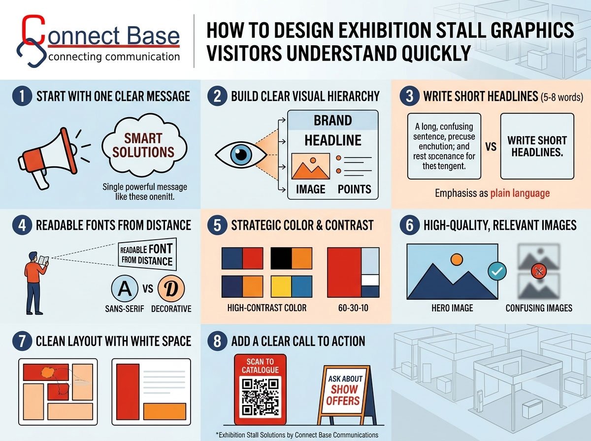
1. Start With One Clear Message
The most common mistake in stall graphics is trying to say too much. Exhibitors often want to show every product, every certification, every client logo and every service on the same panel. The result is visual noise, and visitors read nothing.
Choose one main message for the stall. Ask yourself: “If a visitor remembers only one thing about us, what should it be?”
Some examples:
- “Industrial Pumps Built for 24/7 Performance”
- “Smart Packaging Solutions for Food Brands”
- “CNC Machines with Faster Delivery”
Once that message is fixed, everything else on the graphics should support it. Secondary information can live inside the stall on smaller panels, brochures or digital screens.
Practical tip: Write your message in under 8 words. If it needs a long sentence, it needs more editing.
2. Build a Clear Visual Hierarchy
Visual hierarchy means arranging elements so the eye reads them in the right order. Visitors should never have to work out where to look first.
A simple and reliable hierarchy for stall graphics looks like this:
- First level: Brand name and logo (largest, highest contrast)
- Second level: Main headline or tagline
- Third level: Product image or hero visual
- Fourth level: Supporting points, such as 2 or 3 short benefits
- Fifth level: Contact details or QR code (small, placed lower)
Size, colour, contrast and position all create hierarchy. The biggest, brightest and most central element is read first. Use this deliberately.
If everything on a panel is shouting for attention, nothing gets noticed. Leave some elements quiet so the important ones can stand out.
3. Write Headlines That Work at a Distance
Stall graphics are read from 5 to 15 metres away, often while people are walking. That changes how you write.
Keep headlines short. Five to eight words is ideal. Use plain language instead of technical jargon or vague slogans.
Be specific. “Innovative Solutions for Tomorrow” says nothing. “Energy-Saving LED Lighting for Factories” says everything.
Focus on the visitor’s benefit. Visitors care less about what you are and more about what you can do for them. Compare:
- Weak: “Leading Manufacturer of Industrial Valves Since 1995”
- Strong: “Industrial Valves That Reduce Plant Downtime”
Use sentence case or title case. Text in ALL CAPITALS is harder to read in long lines. Reserve capitals for one or two short words.
Before finalising any headline, do the arm’s-length test: print it, stick it on a wall, step back and see whether a colleague can read and understand it in 3 seconds.
4. Choose Fonts and Text Sizes That Are Readable From a Distance
Even a good message fails if visitors can’t read it. Typography is one of the most underrated parts of stall graphics design.
Font choices
- Use clean, bold sans-serif fonts for headlines. They stay legible at a distance.
- Avoid thin, script or overly decorative fonts. They look elegant on a laptop screen but disappear on a large panel.
- Limit yourself to two fonts at most, one for headlines and one for supporting text.
Size guide (approximate)
- Main headline: minimum 10 to 15 cm letter height for viewing from 10 metres
- Sub-headline: 5 to 8 cm
- Supporting text: 2 to 3 cm, usually readable only at close range
As a general rule, every additional metre of viewing distance needs bigger text. If you are unsure, go bigger.
Spacing matters too. Give letters and lines room to breathe. Crowded text feels like hard work, and visitors avoid hard work.
5. Use Colour Strategically for Contrast and Brand Recall
Colour does two jobs in exhibition graphics: it grabs attention and it helps people remember you.
Stick to your brand palette. Consistency builds recognition. If your brand is blue and orange, the stall should be recognisably blue and orange.
Prioritise contrast over beauty. Dark text on a light background, or light text on a dark background, is always easier to read than two mid-tones together. Yellow on white or light grey on silver will look weak under bright exhibition lighting.
Use the 60-30-10 rule:
- 60% dominant colour (background and large areas)
- 30% secondary colour (supporting panels)
- 10% accent colour (call-to-action, highlights, key words)
Remember the lighting. Exhibition halls use mixed lighting, and colours often look different from how they appear on your screen. Always check printed proofs or sample swatches, and plan your stall lighting together with your graphics.
The finish of your printed material also changes how colour looks. A glossy surface can create glare under spotlights, while a matte finish can make colours feel softer. If you are deciding between finishes, read our guide on choosing the right surface finish for an exhibition stall.
6. Use High-Quality, Relevant Images
Images communicate faster than words. A single strong product photo can explain what you do in one second.
Do:
- Use high-resolution images. Stall graphics are printed at large sizes, and low-quality images look blurry and unprofessional.
- Show the product in use or show the result it creates, not just a catalogue shot.
- Use real photographs of your products, team or factory when possible. Authentic images build more trust than generic stock photos.
- Keep the focus on one hero image per panel.
Avoid:
- Collages of many small images. They confuse the eye.
- Stretched, pixelated or over-edited photos.
- Stock images that have nothing to do with your business.
Technical note: For large-format printing, aim for at least 100 to 150 DPI at final size, and always use CMYK colour mode for print files.
7. Keep Layouts Clean With Plenty of White Space
White space (also called negative space) is the empty area around your text and images. Many exhibitors see it as wasted space. In reality, it is what makes the important things visible.
A clean layout helps visitors:
- Read faster
- Focus on the key message
- Feel that your brand is confident and professional
Follow the rule of thirds when arranging elements, and keep your key message around eye level, roughly 1.2 to 2 metres from the floor. Graphics placed too high or too low often go unnoticed, especially in a crowded hall where the lower areas are hidden behind people and the upper areas get lost.
8. Design for Every Side of Your Stall
Different stall formats create different viewing angles, so your graphics need to be planned accordingly.
Inline (one open side): Focus your strongest message on the back wall and fascia. Visitors will see it head-on.
Corner stall (two open sides): Both open sides need strong branding. Use a consistent message on both so visitors arriving from either aisle get the same clarity.
Peninsula or island stalls (three or four open sides): Graphics must work from all directions. Repeat your brand name and primary message on every side, and use hanging signs or tall towers to increase visibility from far across the hall.
The fascia (the top sign board) deserves special attention. It is often the first thing visible from a distance. Keep it simple: logo, brand name and one short descriptor, such as “Packaging Machinery” or “Solar Energy Solutions”.
If your stall has a three-dimensional structure, your graphics should work together with the structure instead of sitting flat on it. This is where professional Exhibition 3D Stall Designing helps. A 3D visualisation lets you see exactly how your graphics will appear from every aisle before anything is printed or built.
9. Add a Clear Call to Action
Once a visitor understands who you are and what you offer, tell them what to do next. A good stall graphic always has a next step.
Effective calls to action for exhibitions include:
- “Scan to See Our Product Catalogue”
- “Get a Free Demo at This Stall”
- “Ask About Show-Only Offers”
- “Meet Our Engineers Here Today”
Place your call to action where visitors naturally pause, for example near the entrance or on the side panel facing the aisle.
QR codes are very useful, but make them big enough to scan (minimum 4 x 4 cm for close-range, larger for distant scanning) and link them to a mobile-friendly page. A QR code leading to a slow or confusing website wastes the interest you just earned.
10. Use Icons and Simple Infographics to Explain Complex Products
If you sell something technical, such as machinery, software or engineering services, explaining it in words can take too long. Icons and simple infographics do this faster.
- Replace long lists with 3 icons and 3 short labels.
- Show a simple process in three steps: Design → Manufacture → Deliver.
- Use before/after visuals or numbers that show results: “40% Less Energy,” “2X Faster Output.”
Keep the icons consistent in style, with the same line thickness, colour treatment and size. Mixed styles look unprofessional.
Numbers are especially powerful. A single bold statistic is more memorable than a full paragraph of claims.
11. Make Sure Graphics and Stall Structure Work Together
Graphics are only one part of a stall. The best results come when design, structure, lighting and graphics are planned as a single system.
Consider these points during planning:
- Panel size and joints: Avoid placing faces, logos or key text across panel joints where they may get cut or misaligned.
- Materials: Different materials, such as fabric, vinyl, acrylic, wood or printed boards, hold graphics differently. Choose materials that suit your budget and the look you want.
- Lighting: Backlit panels, spotlights and LED strips can make graphics pop, but poor lighting can create glare or shadow over key text.
- Fabrication quality: Even great graphics look cheap if the stall build is uneven or poorly finished.
This is why many exhibitors prefer working with a partner who handles both design and build. With expert Exhibition Stall Fabrications, your graphics are applied precisely, panels fit cleanly and the final stall matches the approved design.
For a complete view of how concept, layout and branding come together, explore our Exhibition Stall Designing services.
12. Test Your Graphics Before Finalising
Testing saves money. Before sending files to print, run these quick checks:
The 5-second test: Show the design to someone unfamiliar with your business for 5 seconds, then ask what you do. If they can’t answer, simplify.
The distance test: View the design on a screen from 5 to 10 metres away. Can you still read the headline?
The squint test: Squint at the design. The most important elements should still be visible. If they fade into the background, increase contrast or size.
The mobile photo test: Take a photo of the design on your phone. Visitors will photograph your stall and share it, so your graphics should look good in photos too.
The proofread test: Check every spelling, phone number, email and website address. A typo on a large printed panel is expensive and embarrassing.
Common Exhibition Stall Graphics Mistakes to Avoid
Here is a quick checklist of mistakes we see most often:
- Too much text. Stall graphics are not brochures.
- Tiny logos. Your brand should be visible from the aisle.
- Low-contrast colours. Pretty on screen, invisible in the hall.
- Low-resolution images. Blurry photos damage credibility.
- No clear message. Visitors can’t tell what you sell.
- Ignoring sightlines. Key content placed too high or hidden behind counters.
- Inconsistent branding. Different fonts, colours and styles across panels.
- No call to action. Visitors understand you but don’t know what to do next.
- Last-minute design. Rushed graphics lead to errors and missed details.
- Designing without the stall structure in mind. Graphics and structure must be planned together.
A Simple Step-by-Step Process for Designing Stall Graphics
If you want a practical workflow, use this one:
Step 1: Define your goal. Lead generation, product launch, brand awareness or direct sales? The goal shapes the message.
Step 2: Know your audience. Who visits this expo? Buyers, distributors, engineers or end customers? Write for them.
Step 3: Pick one core message. Short, specific and benefit-led.
Step 4: Plan the layout. Decide what goes on the fascia, back wall, side panels and counters.
Step 5: Choose visuals. Select a hero image, icons and a colour palette.
Step 6: Design in 3D. View the stall as visitors will see it, from each aisle and each distance.
Step 7: Test and refine. Run the 5-second test and get feedback.
Step 8: Finalise print files. Check bleed, resolution, colour mode and text.
Step 9: Print, fabricate and install. Work with a team that handles quality control and on-site setup.
Step 10: Review after the show. Note which panels attracted attention and which didn’t, then use those lessons for your next exhibition.
Planning for Upcoming Expos
If you are preparing for a trade show or industrial exhibition, start your graphics planning at least 4 to 6 weeks before the event. This leaves time for design, revisions, printing and fabrication.
Industrial and engineering expos such as the upcoming Engitech Expo Ahmedabad and India Industrial Fair – Udyam are competitive environments where hundreds of exhibitors fight for the same visitors’ attention. Clear graphics give you an edge. Read our expo guides to plan ahead:
Why Work With Connectbase Communications
At Connectbase Communications, we help exhibitors turn ideas into stalls that attract, inform and convert. Our team combines creative design, 3D visualisation, branding and in-house fabrication so that every part of your stall works together.
What you get when you work with us:
- Concept to completion: one team for design, graphics, fabrication and installation
- 3D previews so you approve the look before it is built
- Graphics planned around visitor behaviour, not just aesthetics
- On-time delivery and on-site support during setup
- Custom solutions for every budget, stall size and industry
Whether you need a compact 9 sqm stall or a large custom island booth, we build stalls that visitors understand at a glance.
Explore our services:
Frequently Asked Questions
How much text should be on exhibition stall graphics?
As little as possible. Aim for one headline of 5 to 8 words and two or three short supporting points. Put detailed information in brochures, screens or QR-linked pages.
What is the best font for exhibition stall graphics?
Bold, clean sans-serif fonts such as Montserrat, Poppins, Helvetica or Roboto are easy to read from a distance. Avoid thin, script and decorative fonts for main headlines.
How big should the logo be on a stall?
Your logo should be visible from the aisle and from at least 10 metres away. Place it on the fascia and the main back wall, and repeat it on every open side.
What colours work best for trade show booth graphics?
High-contrast combinations that follow your brand palette work best, such as dark on light or light on dark. Limit yourself to two or three main colours and one accent for calls to action.
When should I start designing my stall graphics?
Ideally 4 to 6 weeks before the exhibition. This gives time for design, feedback, revisions, printing and installation without rushing.
Should I use a QR code on my stall?
Yes, if it is large enough to scan and links to a fast, mobile-friendly page. Always pair it with a clear instruction such as “Scan for Catalogue.”
Can Connectbase Communications handle both design and fabrication?
Yes. We offer stall design, 3D visualisation, graphics planning and fabrication under one roof, so your final stall matches your approved design.
Conclusion
Great exhibition stall graphics are not about adding more. They are about removing everything that gets in the way of one clear message. When your brand name is visible, your headline is short, your colours contrast well, your images are strong and your call to action is obvious, visitors understand you in seconds, and that is when real conversations begin.
Remember these essentials:
- One message, clearly stated
- Strong visual hierarchy
- Readable fonts and sizes
- High-contrast colours
- Quality images and clean layouts
- Graphics planned together with stall structure
- Testing before printing
If you are planning your next exhibition and want graphics that work, the team at Connectbase Communications is ready to help.
📩 Email: bhavesh.connectbase@gmail.com
🌐 Website: www.connectbasecommunications.com
