
Exhibition Stall Design & Fabrication
Not every exhibitor gets a 12×12 or a corner booth. Most businesses — especially first-time exhibitors, startups, and SMEs — work with compact spaces of 9 sqm, 12 sqm, or even smaller shell schemes. The good news? Booth size has almost nothing to do with how impressive your stall looks. With the right design strategy, a small exhibition stall can outshine stalls three times its size.
At Connectbase Communications, we’ve designed hundreds of exhibition stalls across every size category, and we’ve seen it firsthand: it’s not the square footage that impresses visitors — it’s the smart use of that footage. In this guide, we’ll walk you through proven, practical techniques to make your small stall look bigger, feel more premium, and pull in more footfall than your neighbors with double the space.
Before jumping into solutions, it helps to understand what makes small stalls look cramped or cheap in the first place:
The fix isn’t a bigger budget — it’s better design decisions. Let’s get into the specifics.
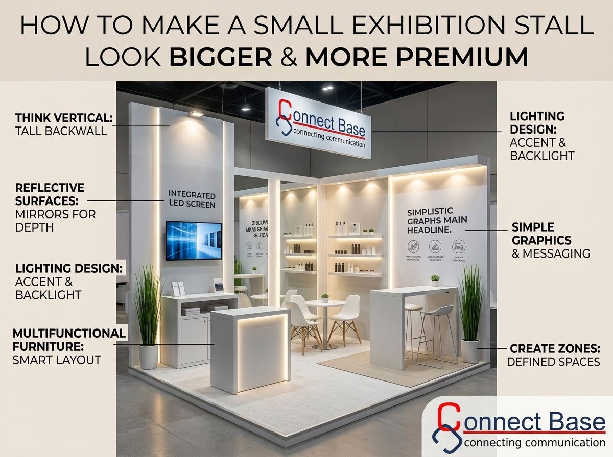
One of the biggest mistakes exhibitors make with small stalls is designing only for the floor plan and ignoring the vertical axis. Height creates the illusion of scale and grandeur.
A stall that uses vertical space well will always feel larger than one that stays flat and low, regardless of actual square footage.
Dark colors absorb light and visually shrink a space. Light, neutral tones — whites, soft greys, pale golds, and muted pastels — reflect ambient light and make boundaries less defined, tricking the eye into perceiving more depth.
This single change — swapping a dark palette for a light one — can make an identical floor plan feel 20–30% more spacious.
Mirrors are a classic interior design trick, and they work just as well in exhibition stands. A well-placed mirrored panel or glossy acrylic surface can visually double the depth of a stall.
Used sparingly, this technique adds a premium, boutique feel while genuinely expanding the perceived space.
Bulky furniture is the fastest way to make a small stall feel like a storage room. Instead, invest in furniture that does more with less footprint.
Every piece of furniture should earn its place. If it doesn’t serve a clear purpose, it’s eating into your limited space for no reason.
Lighting is arguably the single most underrated factor in making a stall feel premium. Flat, uniform lighting flattens a space and makes it look generic. Layered lighting creates depth, drama, and a high-end retail feel.
A stall with thoughtful lighting will consistently outshine a larger stall lit only by the venue’s standard overhead fixtures.
Small stalls cannot afford visual clutter. If a visitor has to stop and read a paragraph to understand what you do, you’ve already lost them — and made your stall look busier and smaller than it is.
Minimalist, confident branding always reads as more premium than a wall crammed with information.
Even in a small footprint, dividing the stall into subtle functional zones — a display zone, a meeting zone, a product demo zone — makes the space feel organized and intentional rather than cramped.
Organized space reads as premium space. Visitors associate clutter with low quality and clarity with confidence.
A few well-placed plants — real or high-quality artificial — instantly soften a stall and make it feel more like a curated retail space than a temporary structure.
This is a low-cost addition with a disproportionately high visual payoff.
A small stall built with premium materials will always outperform a larger stall built with cheap ones. Visitors form an impression of your brand’s credibility within seconds of glancing at your stand.
One striking, well-built element does more for your brand’s perceived value than ten mediocre ones.
Digital elements let you pack more content and interactivity into a small footprint without physically cluttering the space.
Technology signals innovation and premium positioning — both are especially valuable when your physical space is limited.
Design can only do so much — how your team occupies and manages the space matters just as much.
A well-managed team makes even a tiny stall feel active, professional, and premium.
The techniques above work best when they’re combined thoughtfully by designers who understand spatial planning, material selection, and brand storytelling — not applied piecemeal. This is exactly where a specialized exhibition stall design company adds the most value: turning a restrictive floor plan into an opportunity for smart, premium design.
At Connectbase Communications, we specialize in designing exhibition stalls that punch above their size — using layout planning, lighting design, custom fabrication, and branding strategy to make every square foot count. Whether you’re working with a 9 sqm shell scheme or a larger custom stall, our team designs with one goal: making your brand look bigger, bolder, and more premium than your booth size suggests.
Can a small exhibition stall really compete with larger stalls? Yes. Visitor attention is driven by design clarity, lighting, and branding — not raw square footage. A well-designed small stall frequently outperforms a poorly designed large one in both footfall and lead quality.
What’s the most cost-effective upgrade for a small stall? Lighting. Layered, warm lighting dramatically improves the perceived quality of a stall for a relatively small investment compared to structural changes.
How much should I budget for a premium small stall design? Budgets vary by city, materials, and customization level. The key isn’t spending more overall — it’s allocating your budget toward one or two standout features (like a branded LED backdrop or a custom reception counter) rather than spreading it thinly.
Should I use a shell scheme or a custom stall for a small space? Custom stalls generally offer more flexibility to apply techniques like vertical branding and zoning, but a shell scheme can also be transformed significantly with the right graphics, lighting, and furniture upgrades.
A limited floor plan doesn’t have to mean a limited impression. With the right layout, lighting, materials, and branding strategy, your small exhibition stall can command more attention than booths twice its size.
Connectbase Communications designs and fabricates exhibition stalls that maximize impact within any footprint. Get in touch to discuss your next exhibition:
Keep reading
WhatsApp us
 +91 7600576410