
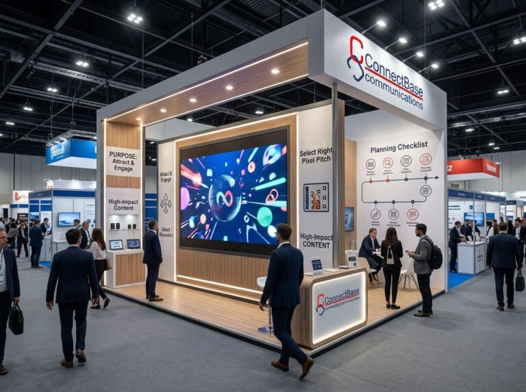
Exhibition Stall Design & Fabrication
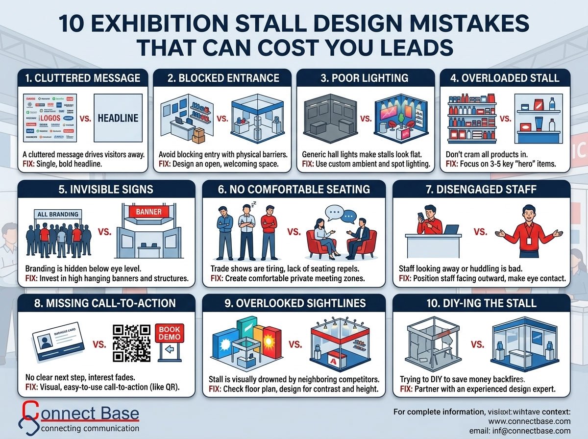
Avoid these 10 common exhibition stall design mistakes that silently kill your lead generation. Expert tips from Connectbase Communications, a leading exhibition stall design company.
Every year, businesses spend lakhs of rupees booking exhibition space, printing brochures, training staff, and shipping products — only to walk away from the event with a handful of half-hearted business cards and no real pipeline. The problem is rarely the product. It’s almost always the stall design.
At Connectbase Communications, we’ve designed and executed exhibition stalls across countless trade shows, and we’ve seen the same design mistakes repeated by brands big and small. The good news? Every one of these mistakes is fixable — if you know what to look for before the show floor opens.
In this guide, we break down the 10 most common exhibition stall design mistakes that quietly cost exhibitors leads, and exactly how to avoid them.
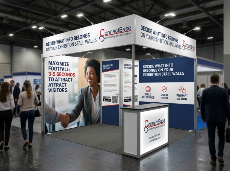
Visitors walking a trade show floor spend an average of 3 to 5 seconds deciding whether to stop at a stall. If your booth doesn’t communicate what you do and why it matters within that window, you’ve already lost the visitor to the stall next door.
The mistake: Cramming your logo, tagline, product list, achievements, and contact details all onto one oversized banner, hoping visitors will read everything.
The fix: Use a single, bold headline that answers “what’s in it for me” for the visitor. Keep supporting text minimal. Your stall should be scannable, not readable — save the details for the conversation, not the wall.
One of the biggest silent lead-killers is a stall layout that unintentionally blocks visitors from entering.
The mistake: Placing a reception counter, product display, or furniture directly at the entrance of the stall. This creates a physical and psychological barrier, making visitors feel like they need “permission” or a reason to step in.
The fix: Design an open, welcoming entry point. Angle your counters, keep walkways wide, and use the layout to pull visitors in rather than make them stop and ask “can I come in?” A well-designed exhibition stall should invite footfall from multiple directions, not funnel it through one narrow gap.
Lighting is one of the most underestimated elements of exhibition stall design — and one of the most powerful.
The mistake: Relying on the exhibition hall’s standard overhead lighting instead of custom stall lighting. This makes your booth look flat, generic, and easy to overlook among hundreds of other stalls under the same lighting.
The fix: Use a mix of ambient, accent, and highlight lighting. Backlit logos, spotlighted product displays, and warm accent lighting around seating areas all make a stall feel premium and draw the eye from a distance — which is exactly what gets footfall moving toward you instead of past you.
More products on display does not mean more interest. In fact, it usually means the opposite.
The mistake: Trying to showcase your entire product catalogue in a 12×12 or 20×20 stall, leaving no breathing room and overwhelming visitors with choice.
The fix: Curate. Pick your 3–5 hero products or services — the ones most relevant to the audience at that specific show — and give them proper visual real estate. A focused display signals confidence and expertise; a crowded one signals desperation.
Most exhibitors design at eye level and forget that visitors can spot a stall from 30–40 feet away — but only if there’s something to see above the crowd.
The mistake: Keeping all branding and signage at booth height, making the stall invisible once the hall fills up with people.
The fix: Invest in hanging banners, tension fabric structures, or raised tower signage that’s visible above head height. This is especially critical in large exhibition halls where visitors are scanning the horizon to decide where to walk next.
Trade shows are tiring. Visitors walk for hours, and the stalls that offer a moment of comfortable engagement often convert better than those that don’t.
The mistake: No seating at all, or seating that’s cramped, exposed to the aisle, or positioned so staff and visitors have no privacy for a real conversation.
The fix: Create at least one semi-private meeting zone with comfortable seating, even if it’s a small two-seater. Serious buyers need a place to sit down and actually discuss requirements — this is often where leads convert from “interested” to “qualified.”
Your stall design isn’t just about structure — it’s about how your team occupies that structure.
The mistake: Staff huddled behind counters, on their phones, or clustered in a corner chatting with each other instead of facing outward toward the aisle.
The fix: Design your stall layout so staff naturally stand facing visitor traffic, with clear sightlines and no physical barriers like tall counters between them and the aisle. Brief your team on body language — arms open, facing outward, making eye contact — because even the best-designed stall underperforms with disengaged staff standing in it.
Many stalls look fantastic but give visitors no clear next step, so interest fades the moment they walk away.
The mistake: No visible way to book a demo, scan for a catalogue, enter a giveaway, or schedule a follow-up — visitors leave with a business card in hand and no reason to act on it.
The fix: Build a specific, low-friction CTA into your stall design — a QR code for an instant demo booking, a spin-the-wheel giveaway tied to lead capture, or a live product trial. The CTA should be visually integrated into the design, not an afterthought on a table.
Exhibition halls are competitive real estate, and your stall doesn’t exist in isolation — it exists next to, across from, and among dozens of others.
The mistake: Designing a stall in isolation without checking the floor plan, leading to a booth that gets visually drowned out by a taller, brighter, or more strategically positioned competitor nearby.
The fix: Study the floor plan and neighboring exhibitors before finalizing your design. Choose colors, height, and lighting that help you stand out in that specific context — not just in a design mockup on a laptop screen.
This is the mistake that quietly causes almost every mistake above.
The mistake: Treating stall design as a last-minute task, handed to whoever’s available, using generic templates or reused structures from a previous unrelated event.
The fix: Work with an experienced exhibition stall design partner who understands traffic flow, branding psychology, material quality, and on-ground execution. A professionally designed stall isn’t a cost — it’s a direct multiplier on the ROI of your entire exhibition spend, since it’s the difference between visitors walking past and visitors walking in.
Exhibition stalls are one of the few marketing investments where you get direct, face-to-face access to warm, interested buyers — but only if your design earns their attention and makes it easy for them to engage. Small mistakes in layout, lighting, messaging, or staffing compound quickly, turning a well-funded exhibition presence into a missed opportunity.
The businesses that consistently generate strong leads from exhibitions aren’t necessarily the ones with the biggest budgets — they’re the ones who get the fundamentals of stall design right.
At Connectbase Communications, we specialize in designing and building exhibition stalls that combine strong visual branding with layouts engineered for footfall and engagement. From concept design to on-ground execution, we handle every detail so you can focus on what matters — closing deals on the show floor.
📍 Visit us: www.connectbasecommunications.com 📧 Get in touch: bhavesh.connectbase@gmail.com
Let’s design a stall that works as hard as your sales team does.
Keep reading
WhatsApp us
 +91 7600576410