
October 10, 2026
Connectbase Communications
Every exhibitor faces the same temptation. The stall walls are large, the brand has a lot to say, and everyone on the team wants their favourite product, certification or slogan on display. The result is often a crowded, confusing stall that visitors walk past in seconds.
Your exhibition stall walls are the most valuable advertising space at the show. Visitors read them from the aisle, from across the hall and in the few seconds before they decide whether to step in. What you put on them, and what you leave off, directly affects your footfall, your lead quality and your return on investment.
At Connectbase Communication, we plan and build stalls for exhibitions across India. Over time we have found that the best-performing walls follow one principle: each wall has one job. This guide explains how to decide what information belongs on your stall walls, step by step.
Why Stall Wall Content Matters More Than You Think
Most visitors at a large expo have a limited amount of attention. They may walk past hundreds of stalls in a day, and they decide in about three to five seconds whether yours is relevant to them.
Your walls have to answer three questions in that time:
- Who are you?
- What do you offer?
- Why should I stop?
If a visitor can’t answer these from a distance, they will keep walking, however good your product is. Content that is cluttered, too small or too vague costs you conversations. That makes wall content a business decision, not just a design one.
Step 1: Start With One Clear Exhibition Goal
Before choosing a single word or image, decide what the stall needs to achieve. Different goals call for different wall content:
- Lead generation: walls should push a clear offer and a way to start a conversation.
- Product launch: walls should showcase the new product with strong visuals and one standout benefit.
- Brand awareness: walls should lead with a memorable brand statement and strong identity.
- Dealer or distributor search: walls should highlight your network, support and partnership benefits.
- Export enquiries: walls should show your reach, certifications and international credibility.
If you try to achieve all of these at once, your walls will do none of them well. Choose a primary goal and a secondary one at most, and test every piece of content against them. If an element doesn’t support the goal, it doesn’t belong on the wall.
Step 2: Know Who Is Walking Past
Content that works for engineers may not work for retail buyers or government officials. Ask yourself:
- Who are the main visitors at this particular expo?
- What problem are they trying to solve?
- What language and terminology do they use?
- How much technical detail will they expect at first glance?
For example, at an industrial expo such as an engineering or manufacturing show, visitors are often procurement heads, plant managers and technical buyers. They respond to capacity figures, certifications and application areas. At a consumer or lifestyle show, emotion and visual appeal matter more than specifications.
Understanding the audience lets you speak to them directly. A wall that says “Cut your energy costs by 30%” will attract more attention from a plant manager than “Leading manufacturer of quality solutions.”
Step 3: Use the Three-Layer Content Hierarchy
The simplest way to decide what goes on a wall is to sort all your content into three layers.
Layer 1: The Headline (Seen From a Distance)
This is the first thing visitors read, ideally from 10 metres or more. It should include:
- Your brand name or logo
- One short headline (ideally 6 to 10 words)
- One hero image or product visual
This layer must be readable at a glance. If it takes more than three seconds to understand, simplify it.
Layer 2: The Supporting Message (Seen From the Aisle)
Once the headline earns attention, visitors step closer and look for a reason to enter. This layer can include:
- 3 to 4 key benefits or product categories
- Short descriptive lines
- Icons that make information easy to scan
- A clear statement of what makes you different
Keep each point brief. This is not the place for paragraphs.
Layer 3: The Detail (Seen Inside the Stall)
Visitors who enter are already interested, so you can offer more depth here. Inner walls, counters and display units can carry:
- Technical specifications
- Case studies and application examples
- Certifications and accreditations
- Process explanations
- QR codes linking to brochures, videos or catalogues
The mistake many exhibitors make is putting Layer 3 content on Layer 1 walls. Technical tables on an outer wall are almost never read.
Step 4: Decide What Goes on Each Wall
Not all walls have equal visibility, so each one should get a different job.
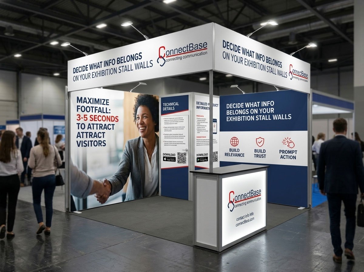
Front or aisle-facing walls should carry your brand identity, main headline and hero visual. This is your billboard.
Side walls and returns work well for secondary messages: product categories, key industries served, or a brand story in a few lines.
Back walls are often the most visible wall once a visitor is inside. They suit major visuals, a company overview, a client or partner wall, or your main call to action.
Counters and display panels are for specific details such as pricing models, product information and contact forms.
Corner or island stalls have multiple open sides, so each open side should work as a front. Make sure the brand and headline are visible from every approach.
If you plan to work with a 3D layout, you can test this visibility before fabrication begins. Our Exhibition 3D Stall Designing service lets you walk through the stall virtually and check what visitors see from each approach. We also explain what to review at this stage in our guide on 3D Exhibition Stall Design: What Clients Should Check Before Approval.
Step 5: Choose Information That Earns Its Place
Here is a practical filter to apply to every piece of content. Ask whether it does at least one of these:
- Attracts attention (a bold visual or headline)
- Builds relevance (shows the visitor you solve their problem)
- Builds trust (proof such as clients, certifications, awards, experience)
- Prompts action (invites the visitor to talk, scan or enquire)
If it does none of these, remove it.
Content That Usually Deserves a Place
- A benefit-led headline. Tell visitors what they gain, not just what you do.
- Your logo and brand colours. Recognition matters, especially for repeat expos.
- Hero product or service imagery. Real, high-quality visuals outperform generic stock images.
- Three or four core offerings. Enough to explain your range without overwhelming.
- One or two trust signals. Years of experience, number of installations, major clients, ISO or industry certifications.
- A clear call to action. “Scan for catalogue”, “Get a quote today”, “Talk to our experts.”
- Contact details and website. Simple and easy to read.
Content That Usually Doesn’t
- Long paragraphs about company history
- Complete product catalogues
- Small text, dense tables and fine print
- Every certificate and award you have ever received
- Multiple competing slogans
- Low-resolution images or pixelated logos
- Information that is already on your visiting card or brochure
If something is valuable but too detailed for a wall, move it to a QR code, a brochure, a tablet or a conversation with your team.
Step 6: Write Wall Copy That Works at a Glance
The way you phrase content matters as much as what you choose. Follow these rules:
Keep headlines short. If you can’t say it in 10 words, you haven’t decided what the message is.
Lead with benefits. “Reliable packaging for faster delivery” tells visitors more than “Packaging solutions.”
Use plain language. Avoid jargon unless your audience expects it.
Write for scanning. Use short lines, bullet points and icons instead of paragraphs.
Use numbers when they are real. “25 years of experience” or “500+ installations” is more convincing than “extensive experience.”
Have one call to action per wall. Competing instructions confuse visitors.
A useful test: show your wall design to someone unfamiliar with your business for five seconds, then take it away. Ask them what you do. If they can’t tell, simplify further.
Step 7: Respect Visual Hierarchy and Readability
Even the right information fails if it’s hard to read. A few practical guidelines:
- Font size: headlines should be readable from at least 10 metres. As a rule of thumb, every 2.5 cm of letter height is readable from about 8 to 10 metres.
- Contrast: use strong contrast between text and background. Light text on light backgrounds or dark on dark loses impact quickly.
- White space: empty space is not wasted space. It gives the eye a place to rest and makes key messages stand out.
- Eye level: the zone between roughly 1 and 2.5 metres is where people look most. Place critical information there, and use higher areas for branding and lower areas for secondary details.
- Consistency: limit yourself to two or three fonts and a consistent colour palette that matches your brand.
- Lighting: poor lighting can wash out graphics, so plan how light will hit each wall.
For a deeper look at this topic, read our guide on How to Design Exhibition Stall Graphics That Visitors Can Understand Quickly.
Step 8: Use Visuals Instead of Words Wherever You Can
A large share of what visitors absorb from your walls comes from images, not text. Use visuals to carry the message:
- Product photography that shows your product in use
- Infographics that simplify processes or comparisons
- Icons to replace bullet-point descriptions
- Application images showing your product solving a real problem
- Short looping videos on LED screens, which attract attention strongly in busy halls
Whatever you choose, make sure visuals are high resolution and large-format ready. An image that looks sharp on a laptop can look blurry when printed at wall size. The material and finish of the wall also affect how graphics look, so it is worth planning them together.
Step 9: Build Trust Without Cluttering the Wall
Visitors are more likely to engage with a company they trust. But proof does not need to take over the wall. Choose only the most relevant signals:
- Client logos: select 6 to 10 well-known names relevant to the show.
- Certifications: show the two or three most important ones, not all of them.
- Numbers: installations, years in business, countries served.
- Short testimonials: one strong quote is better than five average ones.
- Awards: only recent and relevant recognition.
A “trust strip” along the lower part of a back wall is a clean way to show this without competing with your main message.
Step 10: Add a Clear Call to Action
A wall without a call to action is a missed opportunity. Visitors need to know what to do next. Effective calls to action are specific and low effort:
- “Scan to download our catalogue”
- “Ask about show-only offers”
- “See a live demo inside”
- “Book a free consultation”
QR codes are particularly useful because they bridge the physical stall and your digital presence. Make sure the code is large enough to scan, placed at a comfortable height and linked to a mobile-friendly page. Always test it before the show.
Step 11: Match Content to the Stall Structure
Wall content should work with the structure, not fight against it. Consider:
- Wall size and proportions. A tall, narrow wall suits a vertical headline. A wide panel suits a panoramic image.
- Materials and finishes. Glossy surfaces may reflect light and reduce readability. Matte finishes often photograph and read better. Read our guide on How to Choose the Right Surface Finish for an Exhibition Stall to understand how finish affects your graphics.
- Openings and doors. Don’t place important text where a door, opening or structural join will cut it.
- Fabrication method. Printed fabric, direct print on panels, vinyl, backlit frames and 3D lettering all behave differently. Our Exhibition Stall Fabrications team can advise on which method suits each wall.
Planning content and structure together avoids last-minute problems such as text hidden behind furniture or graphics stretched to fit.
Step 12: Give Your Designer the Right Brief
Good wall content starts with good input. The more clearly you communicate your goals, audience and priorities, the better the design. A strong brief includes:
- The exhibition name, dates and stall size
- Your main goal and target visitors
- Your top three messages in order of priority
- Logos, brand guidelines and high-resolution images
- Any mandatory content (certifications, legal text)
- Competitors and what you want to stand out against
We have covered this in detail in What Information Should You Give an Exhibition Stall Designer Before Starting a Project? It is worth reading before you begin your next stall project.
If you are still choosing a partner, our professional Exhibition Stall Designing service covers concept, layout, wall planning and graphics under one roof, so your messaging and structure stay aligned.
Common Mistakes to Avoid
Based on our experience, these are the errors that most often hurt stall wall performance:
- Trying to say everything. More content usually means less impact.
- Using the company name as the headline. Visitors need to know what you offer, not only who you are.
- Tiny text. If it can’t be read from the aisle, it isn’t doing its job.
- Too many fonts and colours. This makes the stall look chaotic.
- Ignoring the back wall. It is often the most visible surface once visitors are inside.
- Skipping the call to action. Interest without direction rarely becomes a lead.
- Last-minute content changes. These cause rushed printing, quality issues and extra cost.
- Not checking the design in 3D. What looks balanced on a flat file can look very different in the real space.
A Simple Checklist Before You Approve Your Wall Content
Run through these questions before final approval:
- Can a stranger understand what we do within five seconds?
- Does each wall have one clear purpose?
- Is the headline readable from a distance?
- Have we removed everything that doesn’t support our main goal?
- Do we have proof (clients, numbers, certifications) without clutter?
- Is there a clear call to action, and does the QR code work?
- Are all images high resolution?
- Has the layout been reviewed in 3D?
- Are contact details correct and easy to find?
- Has someone proofread every line of text?
If you can answer yes to all of these, your walls are ready.
Final Thoughts
Deciding what information belongs on your exhibition stall walls is really about discipline. The strongest stalls don’t say the most. They say the right things, in the right place, in the right order.
Start with a clear goal, understand your audience, sort content into headline, supporting and detail layers, and give every wall a single job. Use visuals to carry the message, add just enough proof to build trust, and always finish with a clear next step for the visitor.
When your wall content and your stall structure work together, visitors understand you faster, stay longer and are more likely to become leads.
Plan Your Next Exhibition Stall With Connectbase Communication
At Connectbase Communication, we help exhibitors turn ideas into stalls that attract attention and generate enquiries, from concept and 3D visualisation to fabrication and on-site installation.
Explore our services:
Ready to start? Visit www.connectbasecommunications.com or email us at bhavesh.connectbase@gmail.com for a free consultation and quote.
