
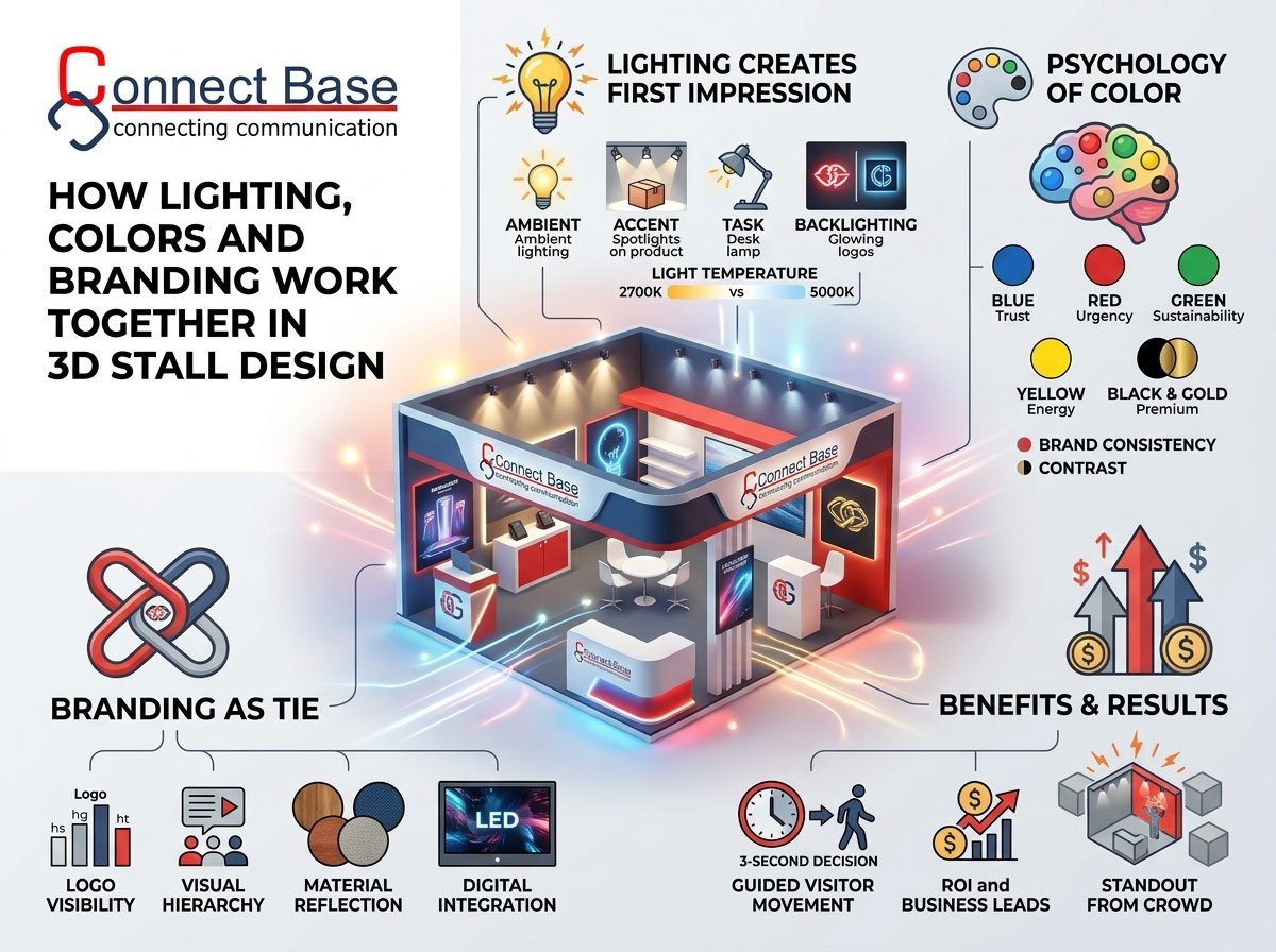
When visitors walk down a crowded exhibition hall, they make a decision about which stall to enter in under three seconds. In that split-second window, no one is reading your brochure or scanning your product catalogue. What actually captures attention is how your stall looks and feels — and that experience is shaped almost entirely by three elements working in harmony: lighting, color, and branding.
At Connectbase Communications, we design exhibition stalls that don’t just occupy space on a show floor — they command it. Over years of building custom 3D exhibition stands for brands across industries, we’ve learned that lighting, color psychology, and brand identity are not separate design tasks handled in isolation. They are one integrated system. Get the balance right, and your stall becomes a magnet. Get it wrong, and even the most expensive booth structure falls flat.
In this article, we break down exactly how these three elements interact, why they matter for your ROI at trade shows, and how a thoughtfully designed 3D exhibition stand can turn footfall into real business leads.
Why Lighting, Color and Branding Can’t Be Designed in Isolation
Many exhibitors make the mistake of treating stall design as three separate checklists: pick a color scheme, install some lights, and slap the logo wherever it fits. This fragmented approach almost always produces a stall that feels disjointed — bright in the wrong places, branding lost in shadows, or colors that clash with the lighting temperature.
A professional exhibition stand design agency approaches these elements as a single visual language. The lighting should highlight your brand colors, not wash them out. Your color palette should be chosen with the venue’s ambient lighting in mind. And your branding — logos, taglines, signage — needs both color contrast and directional lighting to stay legible from across the hall.
When these three work together, the result is a stall that guides the visitor’s eye exactly where you want it: toward your product, your brand name, and your sales team.
The Role of Lighting in 3D Exhibition Stall Design
1. Lighting Creates the First Impression
Before a visitor registers your logo or your product display, they register brightness, warmth, and contrast. A well-lit stall signals professionalism and energy; a dimly or unevenly lit one signals the opposite, regardless of how much money went into the structure itself.
2. Types of Lighting Used in Exhibition Stands
Modern 3D exhibition stall design typically layers multiple lighting types:
- Ambient lighting – general illumination that sets the overall mood of the stall.
- Accent lighting – spotlights or track lights used to highlight specific products, brand walls, or focal displays.
- Task lighting – functional lighting for reception counters, meeting pods, and product demo areas.
- Backlighting – used behind logos, signage, or fabric graphics to make branding glow and stand out from a distance.
- Color-changing LED lighting – programmable lighting that can shift hues to match brand colors or create dynamic effects during live demonstrations.
3. Lighting Temperature Matters More Than You Think
Lighting isn’t just about brightness — it’s about temperature, measured in Kelvin. Warm white lighting (around 2700K–3000K) creates a cozy, premium feel, often used by lifestyle, hospitality, and luxury brands. Cool white lighting (4000K–5000K) feels crisp, modern, and technical — ideal for IT, engineering, and industrial exhibitors. Mismatching lighting temperature with your brand tone can subtly undermine the message you’re trying to send, even if visitors can’t articulate why something feels “off.”
4. Directional Lighting Guides Visitor Movement
Smart exhibition stand designers use lighting almost like a spotlight director on a stage. Brighter zones pull visitors deeper into the stall, while accent lighting on a product wall or meeting area naturally draws the eye and feet in that direction. This is a technique we use extensively at Connectbase Communications — designing light “pathways” that move visitors from the entrance, through the brand story, and toward the conversion point (a demo desk, a product display, or a meeting pod).
The Psychology of Color in Exhibition Stand Design
Color is one of the fastest, most emotional signals the human brain processes — often before conscious thought kicks in. That’s why color choice in your 3D exhibition stall design is never purely aesthetic; it’s strategic.
How Different Colors Influence Visitor Behavior
- Blue conveys trust, stability, and professionalism — common in finance, technology, and healthcare stalls.
- Red creates urgency and excitement, often used for calls-to-action, promotional zones, or food and beverage brands.
- Green signals growth, sustainability, and wellness — popular with eco-conscious and agricultural brands.
- Yellow and orange grab attention and radiate energy, useful for brands wanting to appear approachable and youthful.
- Black and gold communicate luxury, exclusivity, and premium positioning.
- White and neutral tones offer a clean, minimalist canvas that lets products and lighting do the talking.
Brand-Consistent Color Palettes
Your exhibition stall is a physical extension of your brand identity, and that means the color palette used across your website, packaging, and marketing collateral should carry through to your stand design. A visitor who has already seen your brand online should instantly recognize your stall on the show floor through consistent color cues — long before they read your company name.
Color Contrast for Visibility
In a hall filled with dozens of competing stalls, color contrast is what makes your branding readable from a distance. Light text on a dark background (or vice versa) ensures your logo and messaging remain legible even in low-light exhibition halls or from 15–20 feet away. This is where lighting and color intersect directly: the right accent light on a high-contrast color panel can make your branding visible from almost anywhere on the floor.
Branding: The Thread That Ties It All Together
Lighting and color exist to serve one ultimate purpose in exhibition design — reinforcing your brand identity so strongly that visitors remember you long after the event ends.
1. Logo Placement and Visibility
Your logo needs to be visible from multiple angles and distances — from across the aisle, from the entrance of the hall, and up close at your counter. Backlit logo walls, illuminated hanging signage, and strategically lit header panels all ensure your brand mark is impossible to miss.
2. Storytelling Through Visual Hierarchy
A well-branded stall doesn’t just display a logo — it tells a story. Lighting and color work together to create visual hierarchy: the brightest, most color-saturated zone should be your hero message or flagship product, while supporting information (brochures, secondary displays) sits in secondary lighting zones.
3. Material and Texture Choices Reflect Brand Personality
Branding isn’t limited to color and logos — it extends to materials. Matte finishes, fabric panels, wood textures, and metallic accents all communicate different brand personalities, and lighting interacts differently with each. Glossy surfaces reflect light dramatically and suit bold, modern brands; matte and fabric textures diffuse light softly, suiting brands that want a warmer, more approachable feel.
4. Digital Branding Integration
Modern 3D exhibition stalls increasingly integrate LED video walls, digital signage, and interactive touchscreens. These digital elements need to be lit and color-balanced carefully so they don’t clash with ambient stand lighting or wash out under bright overhead venue lights.
Bringing It All Together: A Practical Framework
When Connectbase Communications designs a 3D exhibition stall, we follow an integrated framework that treats lighting, color, and branding as interconnected design decisions from day one:
- Start with brand identity – logo, brand colors, tone, and target audience define the foundation.
- Design the 3D layout – plan visitor flow, focal zones, and open sightlines before finalizing structure.
- Select the color palette – choose primary, secondary, and accent colors aligned with brand guidelines and psychological impact.
- Layer the lighting plan – combine ambient, accent, task, and backlighting to support the color scheme and guide visitor movement.
- Test under show conditions – lighting that looks perfect in a design render can behave differently under a convention hall’s fluorescent ambient lighting, so on-site testing and adjustment matter.
- Reinforce branding at every touchpoint – from the header signage to the reception desk to the giveaway counter, every zone should reflect the same color and lighting language.
Common Mistakes to Avoid
- Over-lighting the entire stall equally, which removes visual hierarchy and makes nothing stand out.
- Using too many competing colors that dilute brand recognition instead of reinforcing it.
- Ignoring venue lighting conditions, resulting in colors that look different on-site than they did in design mock-ups.
- Placing branding in poorly lit corners, wasting valuable signage investment.
- Choosing trendy colors over brand-consistent ones, which confuses returning visitors and dilutes long-term brand recall.
Why This Matters for Your ROI
Exhibition participation is a significant investment — in booth space, logistics, staffing, and travel. A stall that fails to attract footfall or fails to leave a memorable brand impression wastes that investment. Research consistently shows that visual design is one of the top factors influencing whether a visitor stops at a stall, and lighting combined with strong color-branding contrast is repeatedly cited as a key driver of stall traffic at trade shows.
A well-executed 3D exhibition stand isn’t just about looking good in photos — it’s a functional business tool designed to attract the right visitors, communicate your brand story instantly, and support your sales team in converting conversations into leads.
Partner With Experts Who Understand the Full Picture
Designing a stall that seamlessly blends lighting, color psychology, and brand storytelling requires more than a general contractor — it requires a team that thinks like both a designer and a brand strategist.
At Connectbase Communications, we specialize in custom 3D exhibition stall design that brings lighting, color, and branding together into one cohesive, high-impact experience. From concept 3D renders to on-site execution, our team ensures your stand doesn’t just meet industry standards — it becomes the stall people remember long after the show ends.
Ready to design an exhibition stall that truly reflects your brand and stops visitors in their tracks?
Visit us at www.connectbasecommunications.com or write to us at bhavesh.connectbase@gmail.com to discuss your next exhibition stand project.
Connectbase Communications — Exhibition Stall & Stand Design Experts.
